5 top colors of 2021
hi-5
Our top 5 picks … for everything design-related & more!
november 2020
We’re big fans of color around here! We always get excited each year when the various paint companies announce their choices for Color of the Year or Color Trends for the year.
Today, we’re highlighting 5 of the top colors for 2021 from 5 different companies. All the colors trend towards warmer, organic tones. They reflect richness, comfort, and a chance to reset, which seems appropriate to us after the challenges 2020 has thrown our way.
2021, we’re ready for you, both in terms of color and life!
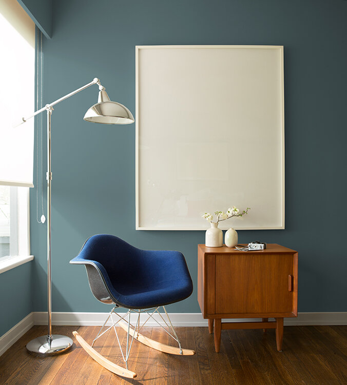
benjamin moore: aegean teal, 2136-40
photo credit: benjamin moore
This deep teal is a combination of green, blue, and grey and is bold, but soft.
Benjamin Moore describes Aegean Teal as “creating natural harmony.” It is welcoming and calming. The color pairs nicely with warm creams and golden woods. We think it would work as a rich wall color or an awesome accent on kitchen cabinets or painted millwork.

sherwin williams: urbane bronze, SW7048
photo credit: room and board
This color is a warm, rich bronze inspired from nature. Again, reflecting on the changes to our daily lives as we live and work through a pandemic, it makes you feel cozy and comfortable.
Sherwin Williams describes it as “creating the ultimate retreat for reflection and renewal….” Urbane Bronze pairs well with other warm neutrals and natural materials like wood and stone.
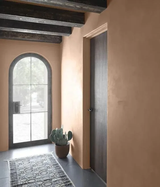
behr: sierra, N240-4
photo credit: behr
The 2021 color collection from Behr, found exclusively at The Home Depot, is meant to “elevate your comfort zone.” We focused on Sierra, which is a “warm and approachable” brown/tan with red undertones. It is a nice medium neutral, which works well with other earthy tones, dark accents, and natural materials. We think it’s an inviting and flexible color that could be used on walls or casework.

HGTV by sherwin williams: passionate, HGSW 2032
photo credit: sherwin williams
This color, part of the 2021 “Delightfully Daring” Collection, found at Lowe’s, is also inspired by nature, but with a surprising twist and vibrancy. It is a bold, earthy red described as “a glass of Merlot backlit by the coziest lamp in your home.” There is a southwest feel to the color, which would work well with whites, creams, dark blues, and natural textures.

farrow & ball: sap green, no. W56
photo credit: farrow & ball
Our favorite, or should we say favourite, British paint company, has a collection of rich, earthy jewel tone paints for 2021. Among them is Sap Green, an earthy, mossy green created in collaboration with the Natural History Museum “to bring the true colours of nature into your home.” This green is soothing and cozy and makes you feel happy to be home. Combine with creams, warm whites, tans, or chocolate browns. Sap Green would work well as a feature wall or in a hall or small room where you want to add some elegance.